A bright, high-contrast identity
A pale palette with a single confident accent and a distinctive halo mark, built to stand out on a phone screen and on a van.
Halo House Co. is a concept for a premium home care brand with a light, luminous feel. We used it to test how far a clean, airy identity can go in a category where most competitors look alike.
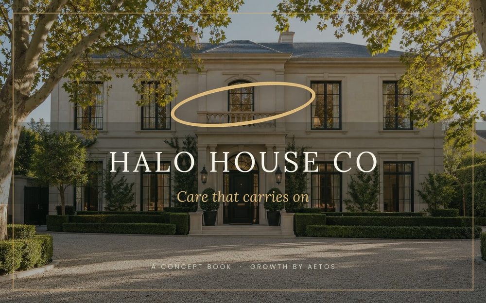
A pale palette with a single confident accent and a distinctive halo mark, built to stand out on a phone screen and on a van.
Routine, deep and move-out services are described by what is actually included, so there is little room for misunderstanding.
A simple way for regular households to confirm, skip or change the next visit without a phone call.
Most households choose between a handful of similar providers, and the difference they can see is presentation. A distinctive mark and precise service descriptions help a brand be remembered, while an easy rebooking step supports the regular visits that recurring work relies on.
No. It is a fictional concept build created by Aetos, not a client business.
They are separate concepts with different tones. Halo is light and airy, while Rosa is warm and editorial.
Yes. A real build starts with the business's own services and how they describe them.
Halo House Co. is a fictional concept build created by Aetos to show its standard of work. It is not a client business, and nothing here describes client results.